Design A Shirt offers a wide variety of fonts to choose from. With multiple choices of fonts in 12 different categories, you are sure to find one or several that will make your design outstanding. However, even with all of the options, choosing your font and using it to its full potential can be challenging, which is why we created this helpful guide to answer commonly asked questions.

When deciding what kind of font to use, it is important to make sure that the text will remain legible once it’s screen printed or embroidered if legibility is your goal.
If you’re only concerned about creating an artistic feel, legibility may not be your main priority. Most people are including text in a design for one reason, for others to read. In this case, your goal is to avoid people asking you what the text says, and eliminate the need for people to stare at your design to try and make sense of it. You also want to make sure that the text remains easy to read at a distance. You don’t want the wording on your design to only be legible when you are directly in front of it. Legibility depends on details such as the complexity of the font, (think scripts and hand written styles,) the sizing, and the color.

While thin fonts may look decent and easy to read on the computer or on different types of print such as postcards, pins, and banners, you need to imagine what it will look like once it’s printed in ink on a shirt or piece of apparel. If you just plan on having one word printed fairly big across a shirt, a thin font might work for you. However, if your design includes small text, it is best to avoid using thin fonts in most cases. A better choice would be a thicker, bolder font so the message is easier to understand and read for those who view it.
NOTE: During the printing process on darker colored apparel, there is an underbase color (usually white or a light color) that is printed before the color of the font is printed on top. The reason for the underbase is to give the top color a brighter look. The underbase color is flashed, or dried directly after it is printed. That underbase color then acts as a block between the shirt color and the color of the top layer. This process introduces a risk when using very thin fonts. If you choose a thin font, it will be more challenging to print it without any underbase color showing.
Your design has personality. Fonts have them too! Some fonts are generic and plain, some are cute and friendly, and others are intense and loud. It is important to choose fonts based on the personality of your brand or messaging. For example, if you opened a bakery and you are in the middle of creating a design for the company, choosing a soft, happy font (Example A) over a staccato font (Example B) can help to express your business. The look of your design reflects the vibe of your brand, therefore you want them to relate to one another. The type of font(s) incorporated into your message and logo give people an idea of your vision.

Script or cursive fonts are great when used appropriately. Just like how thin fonts look best on paper, the same goes for script fonts. The width and complexity of the script font are the two aspects you need to keep in mind when it comes to screen printing or digital printing. Remember, the text will be printed in ink which has the tendency to bleed or expand a little bit. Choosing a script font where the letters are extremely close together could introduce problems with legibility, therefore making it a challenge to make out what the text says. A big industry no-no is using a script font in all caps. It’s like nails down a chalkboard in the design world. Script fonts can work in your favor, but we do recommend that you choose carefully to ensure that the printed outcome meets your expectations.
Including numerous types of fonts in your design can either work nicely, or not work at all. Some fonts share similarities in the sense that they are simple, easy to read, and have similar appearances. However, if you are going to intermix fonts, your best bet is to make them significantly different from one another. If you have two kinds of similar fonts next to each other, it becomes visually confusing and misleading. However, there are many wacky fonts that just won’t pair nicely with certain fonts without changing the meaning or look of the message completely. A great way to add a slight yet beneficial difference is to use the same font but have some words in bold or bigger than the others. This will switch up the look.

Serif fonts have decorative details at the ends of some of the strokes that make up a letter or symbol. These details look like tiny lines coming off of certain ends. Serif fonts seem to be easier to read because the letters are more distinctive and more recognisable. Therefore, they make great font options for the use of screen printing. Sans Serif fonts do not have these details and are typically well suited for text on the web. However, Sans Serif fonts can be used very creatively in many designs. It all depends on the style you’re looking to achieve.

Legibility and ink color go hand-in-hand. It all depends on the look you are going for on your printed shirt. If legibility is your priority, it is best to choose an ink color that contrasts well with your shirt color. This will allow the words to POP and be easily read when worn. If you are going for a tonal look, choosing an ink in a similar tone to your shirt color could render a desirable outcome.
With digital print, the ink absorbs more into the fibers of the shirts. If an ink color is too close to a fabric color, it could get lost in the shirt fibers and may not really be seen. With screen print, we have more of an opportunity to make the ink/fabric color combo work together.
While designing your logo on the computer, keep in mind that the end result will be significantly larger once it is burned on a screen and printed on a garment. Imagine the front of a t-shirt as your canvas instead of a blank page on your screen. Our design studio allows you to upload your artwork, resize the logo, and place it where you want it to be printed on the shirt. If you have very specific requirements, you can add design notes detailing the exact size you want the logo to be printed and precise placement from the hem or collar if warranted.
A great tip is to print out your finished logo, cut it out, and tape it to the a piece of apparel similar to what you’re intending to have printed.. This way, you are able to get a better visible idea of what the sizing will look like printed on the finished product.

With so many different font categories, we offer the ability to sense the mood or emotion from different types. Some are dainty and subtle, some have crazy detail to add a decorative effect, and some are bold and demanding. Choosing a type of font depends on what kind of mood you are trying to convey. It is also important to choose a font that will connect with the audience associated with your logo or brand. Is it a fun group? A serious/professional group? A group of a specific age range? Think about what will be the most fitting look for the type of people who will be interested in your designs. Always keep your audience in mind.
Some designers will want to use the same exact font for their screen printed and embroidery goods. Normally there will not be a problem with this unless the font you want to use is extremely detailed. Accomplishing detailed, clean work is easier with ink than with thread. Adding too much detail in the embroidery can affect the quality of the finished product. Your best bet is to keep it simple with embroidery.

Don’t let the fear of design complications steer you away from creating something unique. The best way to find the perfect font is by trial and error. Choose a bunch of different options, type out what your text will say, then line them all up and let your creative eye choose which one looks the best. Depending on the design, sometimes it’s smart to play it safe and keep things simple, but if you are excited about your design and want to make a powerful impact, go beyond the safe zone! Being unique is the first step to being remembered, and when it comes to t-shirt design, that’s the one thing you want to be.
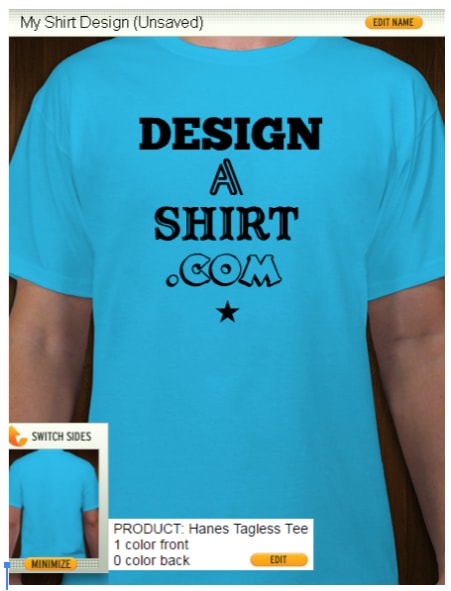
One significant feature of Design A Shirt is the free to use studio where you can experiment with a t-shirt mockup and save different iterations of your work to compare the results. If need be, you are able to take a break and come back to it once you think of some new inspiration!